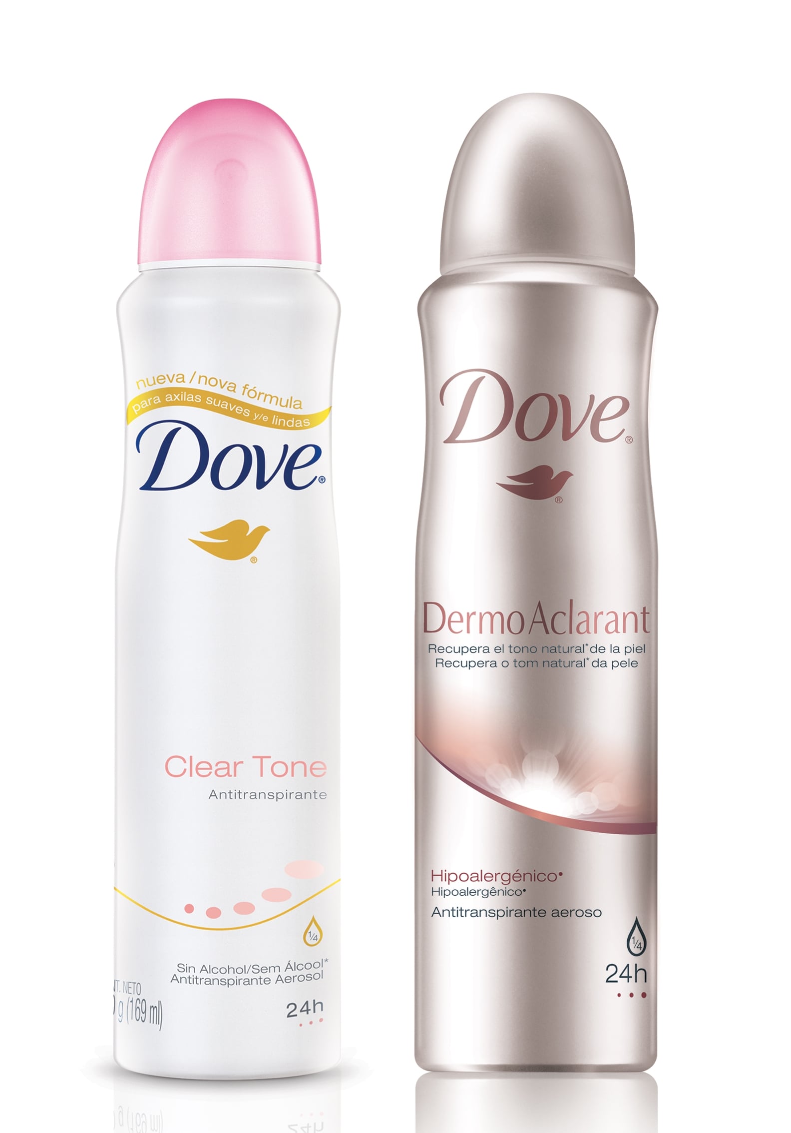
Available throughout Latin America, the DermoAclarant range is an evolution of the brand’s Clear Tone line that was relaunched at the beginning of the year. According to Unilever, it is claimed to ‘recover natural skin color’.
The visual appearance of the new line had to be distinct from that of the existing Dove deodorants in order to reflect the additional benefits of the product, said Casa Rex.
Differentiation of DermoAclarant range
“The products needed to be differentiated from the regular range because it offered an advanced benefit; that of recovering natural skin color and therefore required a more premium positioning,” a Casa Rex spokesperson told CosmeticsDesign.com USA.

The company chose a narrow color palette to indicate a more prestige offering, opting for a silver metallic hue in contrast to the white for the other Dove deodorants.
However, Casa Rex outlined in a case study of the design process the need to establish a link between the new and existing lines. The use of pink for the brand name was continued with the DermoAclarant line, although a more subtle and metallic hue was used, the company said.
The icon on the deodorant packaging was also replaced, which according to Casa Rex communicates the product benefits in a ‘richer more sensorial manner’.
Casa Rex and Unilever collaborations
The design agency has offices in the UK and Brazil, and has worked with Unilever on the packaging design for a number of cosmetics and personal care products.
These include several packaging projects for Signal oral care products for the Asian market, as well as developing the current global design for the Lux soap range, the Casa Rex spokesperson said.
