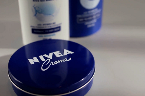
High recognition on the cards as Nivea redesign draws on classic blue tin
It aims to provide some consistency to a brand that had slightly ‘lost its way’ according to executive board member Ralph Gusko, as well as keep in line with the company’s goal of reducing its carbon footprint; the new packs are also recyclable and use 15 per cent less material.
Re-strengthen values
“We have to ensure that our brand identity reflects [our] values, one aspect of which is our product design,” says Gusko.
“Around two-thirds of all purchase decisions are made at the shelf. The new Nivea design’s high recognition value will make it easier for consumers around the world to find the Nivea products they are looking for.”
Gusko explains that having a consistent design language across all channels - from product packaging, through point of sale to advertising - also increases consumer identification with the brand and encourages them to additionally use products in other categories.
Back to its roots
To achieve this, the Beiersdorf brand teamed up with Yves Behar's fuseproject with the goal of taking the 102-year-old brand back to its classic roots.
According to Behar, the blue tin wasn’t just the basis of the design, but also a source of inspiration to the designers.
The crème tin is used as a logo, reflected in the rounded contours of the new packs and in the reduced blue and white colours of the new design. The round lid, which tilts towards the consumer, embossed with the brand logo, has obvious similarities with the iconic blue tin providing a “familiar face” on the shelf.
“Design is important because it adds value to an object’s function,” says Béhar. “Unlike many other skin care brands, Nivea isn’t geared to a specific culture, gender or age group.”
Design language
The new design language is an aspect of the new overall brand strategy focusing on sustainable and profitable growth for the Nivea product family which was recently announced by CEO Stefan F. Heidenreich.
“The new NIVEA design language was created from the ground up to offer consumers a tangible experience of our brand values before they even open the packaging. It’s pure and authentic – like the brand itself,” adds Gusko.
The gradual introduction of the new design for the entire Nivea skin and body care portfolio will commence in more than 200 countries in January 2013.